Back
Wiraki Case Study Header Image

How I hit +61% signup on a Consumer app (in just 3 weeks)

While still in university in 2022, I was selected as a top-performing student in a contest run by Wiraki, a startup dedicated to spotting top talented students: that landed me to join as a UX/UI Designer.

I worked side by side with the founders, collaborating with the CEO on product vision and aligning on the necessary developments with the CTO for smooth implementation. The project, revamping the onboarding flow, took 3 weeks full-time, plus close collaboration during implementation.

As the title spoils: the conversion rate jumped 61% in just a few weeks, from a leaky 23%. Here's how it happened.

Wiraki

Wiraki draws on peer referrals among students who know each other to build rankings that spotlight standout talent, opening better opportunities for students.

Key onboarding actions

Onboarding Actions Graphic

23%

conversion rate

Visualization of the key actions during Wiraki’s onboarding flow

Problem

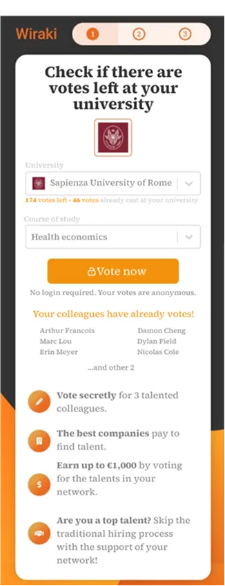
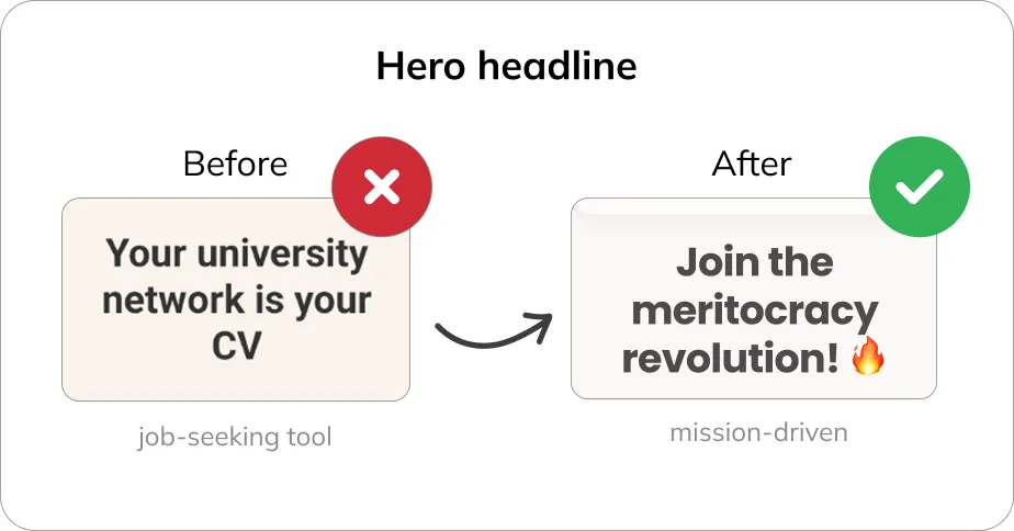
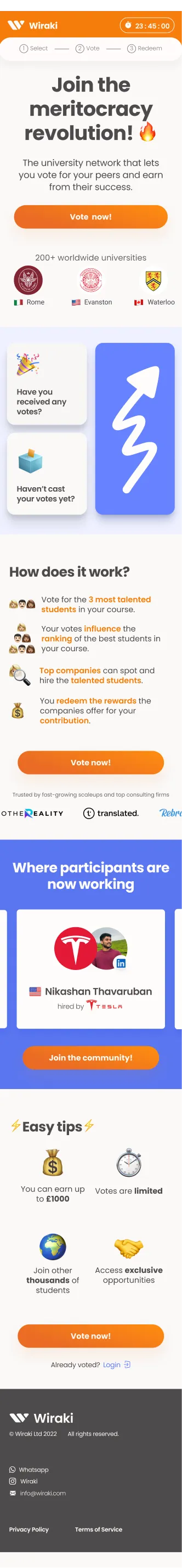
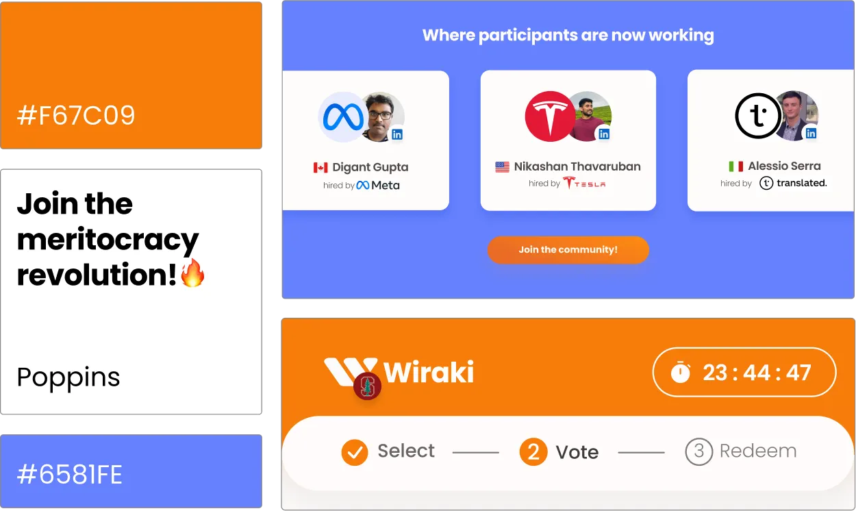
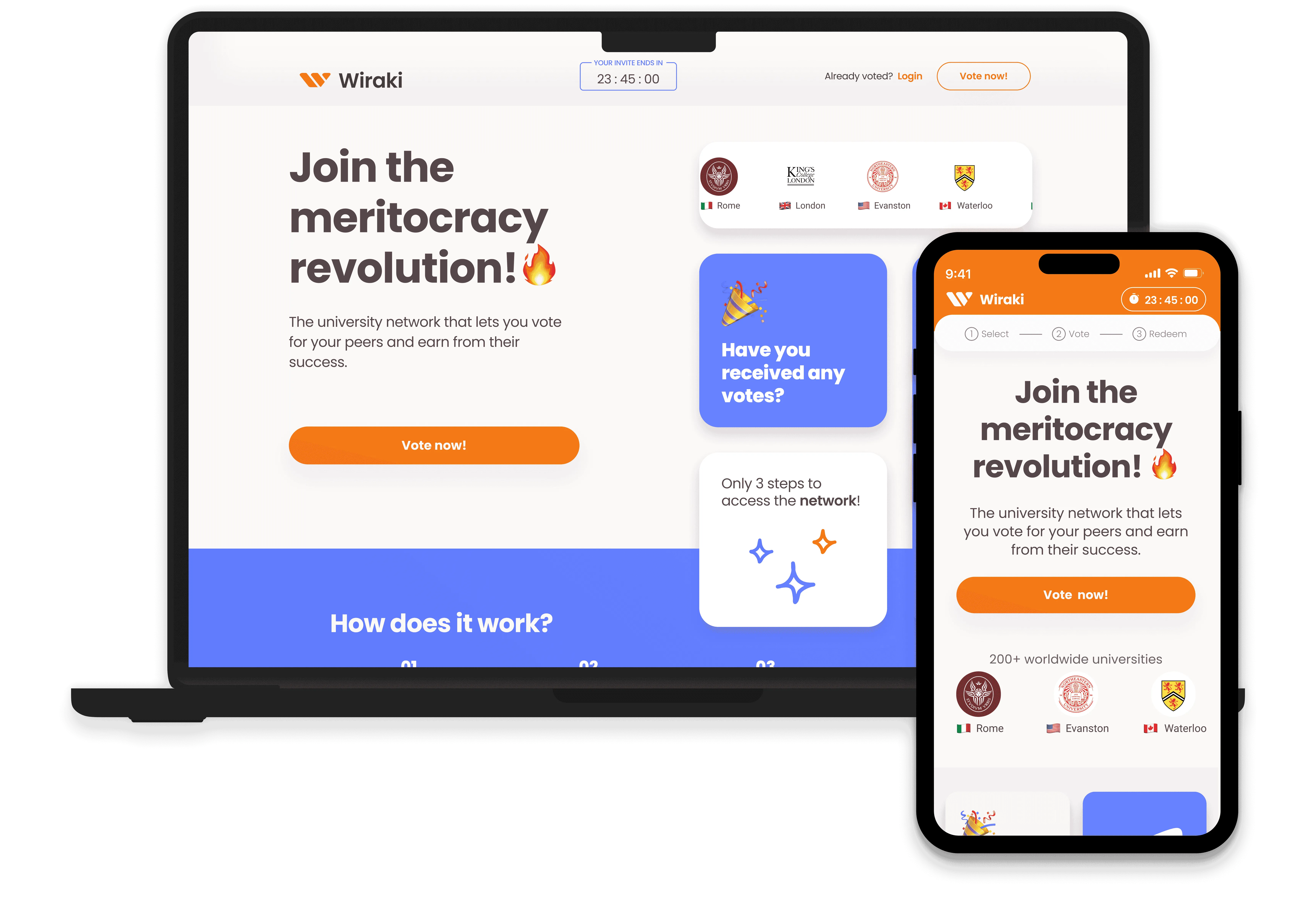
Wiraki targets university students in master's programs, who can provide reliable peer referrals about their colleagues.

Business goals:

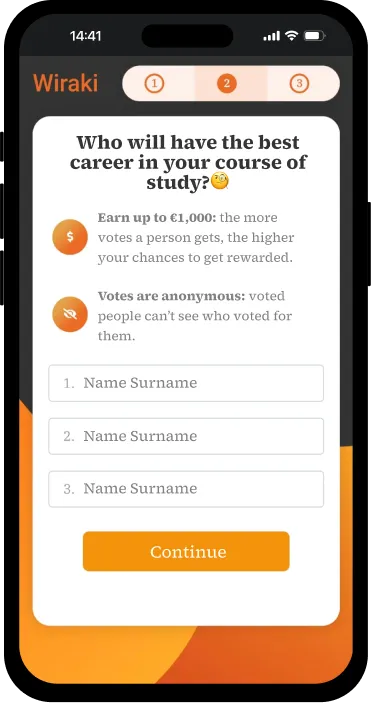
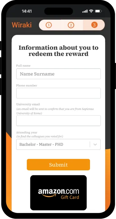
  • gathering data through students' votes to identify top talent and enable high-quality hires for companies
  • driving growth through organic virality to achieve network density and referrals compounding

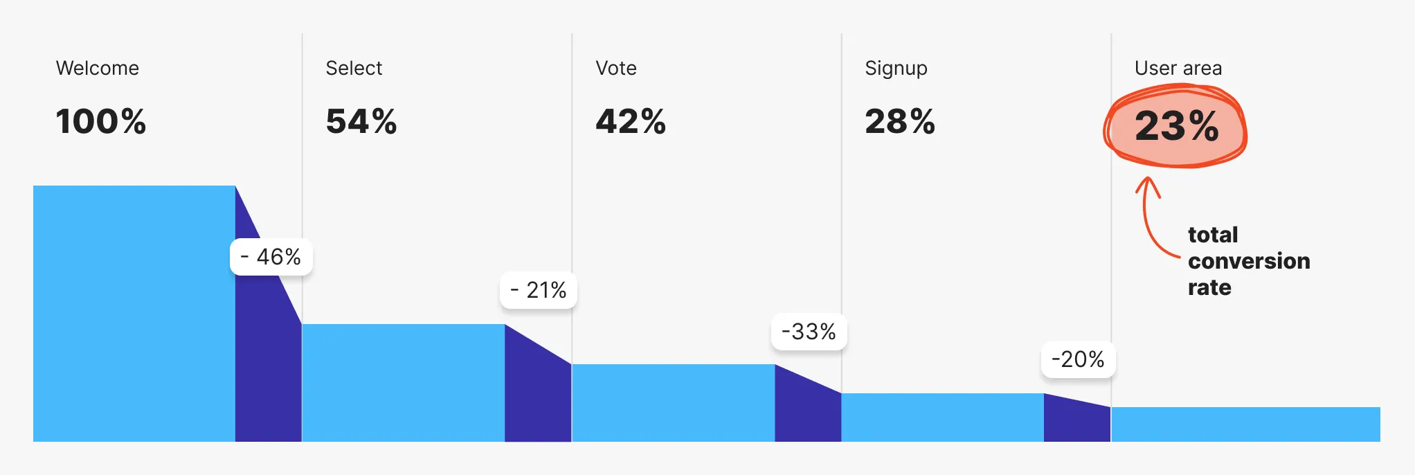
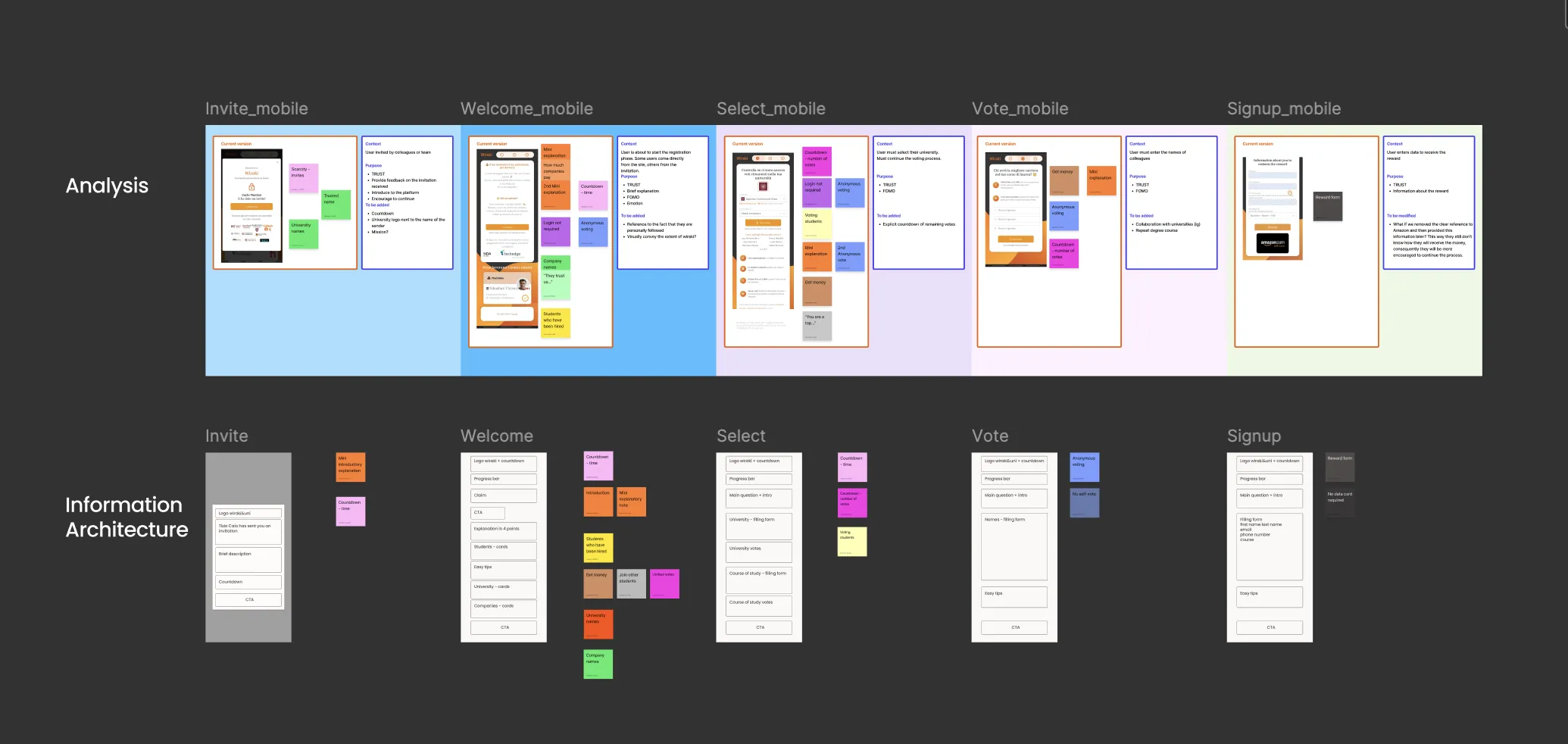
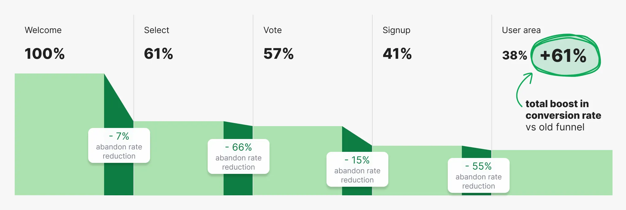
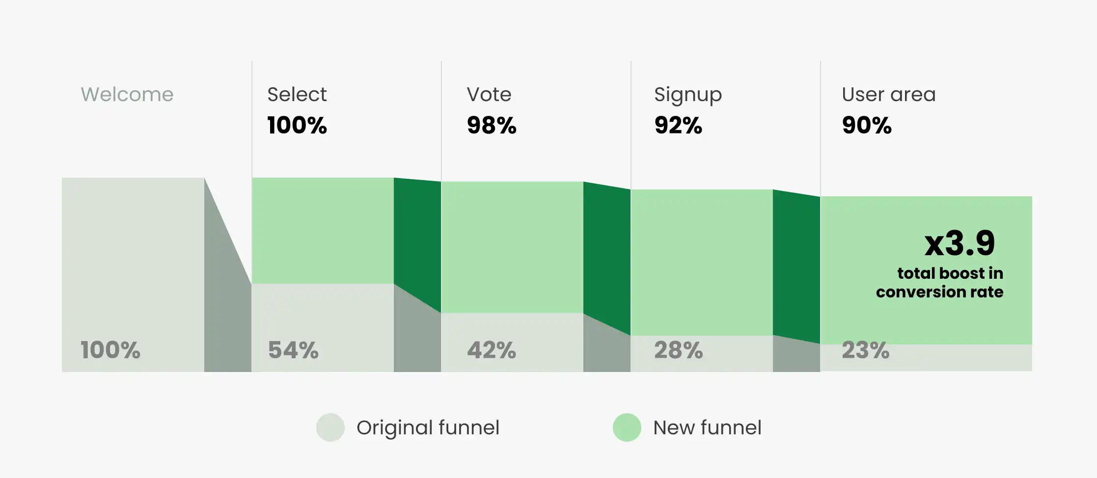
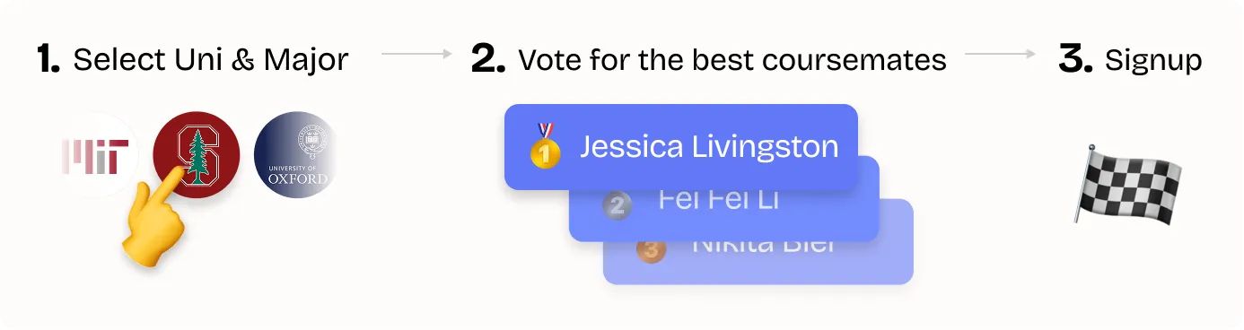
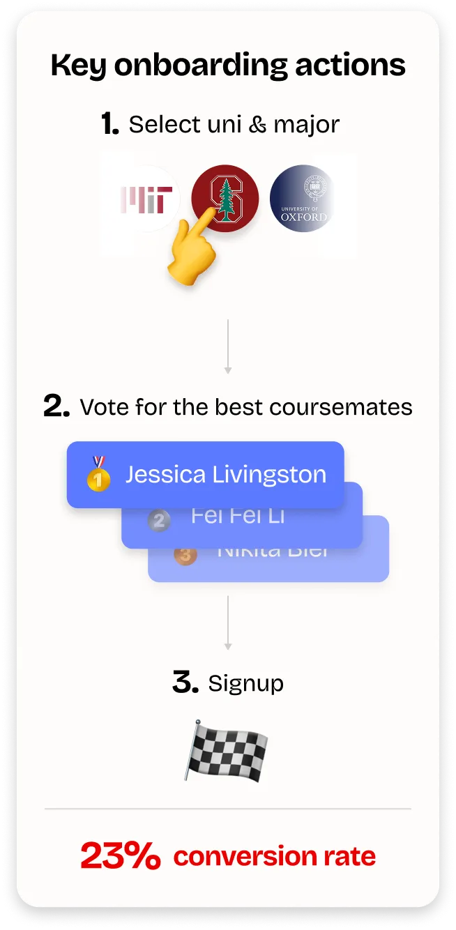
Analytics revealed a leaky onboarding funnel, with only 23% of users completing it. Needless to say, a weak onboarding funnel undermines both goals.

Old Onboarding Funnel

Old onboarding funnel

Analysis

The old Wiraki onboarding flow had cluttered screens with no clear structure, leaving users confused and unclear on the purpose.

Key issues:

  • misalignment with users’ actual goals and needs at each step of the process
  • lack of hierarchy, with competing elements, dense text, and interactive components all demanding attention
  • too many actions at once, blocking a clear path forward

Welcome

45% abandon rate

Scrollable content of the welcome screen
Phone frame

Scroll for full page

Select

21% abandon rate

Scrollable content of the select screen
Phone frame

Scroll for full page

Vote

33% abandon rate

Phone frame

Signup

20% abandon rate

Phone frame

Old Wiraki onboarding

Users got bombarded repeatedly with details about the $1,000 reward across screens, sparking skepticism and eroding trust in the platform from the start.

Instead of letting them focus on core actions like selecting a university or voting, it pulled their attention into deciphering the voting and reward mechanics every time, turning a simple process into a confusing detour.

"$1,000? Is this a scam?"

"I don't understand how it works"

"I'm not looking for a job right now"

“It’s confusing, why should I receive money?”

Interviews with Italian university students showed that, focused on thesis work and close to graduation, they weren’t actively looking for job-finding solutions. The Welcome page headline “Your university network is your CV” suggested exactly what they weren’t seeking at that moment: for them, it was a latent need rather than a priority.

At the same time, the heavy emphasis on money rewards made the site feel suspicious, leading many to question its legitimacy and undermining trust from the very first interaction.

Analysis of communication and information

Analysis of communication and information

That said, the onboarding had real strengths: a simple three-step flow asking only for the minimum data required for the platform to function, with trust builders like social proof (others had already voted) and scarcity (limited votes) to foster confidence and urgency, elements worth retaining.

Constraints shaped the flow

I tackled the revamp with startup constraints in mind: the fast-paced environment demanded quick wins, so I focused on targeted, high-impact changes that didn't disrupt the core flow (Welcome → Select → Vote → Signup), keeping dev work minimal.

This called for sharp prioritisation on low-hanging fruits to boost results fast.

The redesign behind +61% signups

Each screen was refined with targeted enhancements, and the quick wins compounded at every step.

1

-7% abandon rate on Welcome page

I began by addressing two key issues.

First, the hero headline “Your network is your CV” in the Welcome page didn’t align with our LinkedIn outreach, which promoted Wiraki as a meritocratic revolution where everyone wins, by standing out as top talent or by earning rewards for helping others emerge.

Hero headline reframed

Hero headline reframed

Second, interviews with Italian university students showed they were busy with thesis work and graduation, so they weren’t actively looking for job-finding solutions as the headline implied. For them, it was a latent need rather than an immediate priority.

This aligned with Sequoia's Arc PMF Framework, which classifies product–market fit into archetypes based on the type of user problem. In the Hard Fact archetype, users normalise a need as a non-issue and don’t look for fixes, so the challenge is to spark an epiphany that reframes the status quo.

For Wiraki, that meant shifting positioning from a generic job tool to a mission-driven movement, reframing the first impression to create that epiphany for users.

Welcome Old Welcome New

Alongside improving the hero headline, another key change that reduced abandonment was the addition of a countdown throughout the flow. It created urgency, driven by the time-limited invite-only access users received, and reinforced scarcity by framing the opportunity as fleeting.

I also added a sense of progression and anticipation by previewing the three steps (Select, Vote, and Redeem) so users could clearly see the journey and the reward awaiting them at the end.

The old money-first hook was removed and replaced with trust builders: university logos, a clear explanation of how the reward mechanism worked (why and when money would be given), and social proof showing top-voted students now at Tesla, Nvidia, and other leading companies.

2

-66% abandon rate on Select page

Select page in action

Cutting abandonment on the Select page by 66% was driven by progressive disclosure and the sense of reward unlocked step by step.
The old version was cluttered, with inputs, social proof, scarcity, and guidance all crammed together without hierarchy, leaving it confusing and hard to scan.

In the redesign, inputs appeared one at a time.

First came the university field, followed by a blurred section that revealed names of students from that university who had already voted, adding social proof.

Next, the major field uncovered how many votes were left, tying directly to the headline and reinforcing scarcity.


The progress bar also reinforced motivation through the Goal Gradient Effect: with “Redeem” clearly marked as the final step, users felt closer to their reward from the start.

Together, these changes turned the page from overwhelming to motivating, driving a steep reduction in abandonment.

Welcome Old Welcome New
3

-15% abandon rate on Vote page

The Vote page was the foundation of the business, as it collected the peer-referral data that powered the entire model. It was also the most effortful step for users, who had to think of and type in peers’ names, something Smartlook highlighted by showing it as the page with the longest user sessions.

Key improvements included a course-tailored headline that anchored the question into a specific and familiar context, prompting users to think within a defined group rather than facing a vague, open-ended task.

Vote page, old versus new Vote Comparison Mobile

Inputs were prioritised and separated from supporting guidance to reduce cognitive load and make the job to be done obvious. Messaging shifted from reward-first to reassurance-first, addressing doubts like anonymity before presenting incentives, which built trust.

Alongside these, elements already present in the flow, such as the countdown and the progress bar leveraging the Goal Gradient Effect, continued to reinforce urgency and motivation, helping sustain funnel performance at this critical step.

4

-55% abandon rate on Signup page

The Signup page, final step of the onboarding flow, helped deliver the overall +61% increase in signups, with abandonment dropping by 55%.

The redesign focused on making the form simple, clear, and trustworthy. Inputs were visually prioritised, and some fields were paired with short motivations of why the data was needed, tapping into Carnegie’s principle of framing requests around user benefit and the “Because Effect”, which shows people are more likely to act when given a clear reason.

Signup page, old versus new Signup Comparison Mobile

These changes reduced friction, increased confidence, and kept users motivated through the final step.

Looks matter in conversion


To move away from the “scammy” feel of the old UI, I rebuilt the visual language around clarity and credibility. I kept the brand’s orange as the anchor and introduced fresher, high-contrast accents to feel clean and trustworthy.

Since the young age of the targeted audience, I also used emojis headlines and microcopy, adding energy without diluting trust. The outcome: pages that felt clearer and more engaging, another compounding change that contributed to the increase in signups.

Design System

Design System

Outcome

The impact of the onboarding redesign went well beyond the +61% lift.
With more students completing the flow, Wiraki gained richer peer-referral data, denser networks (up by ~50%), and stronger signals for the business to act on.

The project proved how much conversion can be unlocked in just weeks without heavy engineering, showing that compounding wins across each screen could transform not only the user experience, but also the company’s ability to grow.

New Onboarding Funnel

New onboarding funnel

My Achievements and Learnings

  • Learned to thrive without a fixed playbook, adapting quickly to the fast pace of a startup.
  • Built trust with the founders (CEO and CTO) by making my problem-solving process explicit, delivering quick wins, and tying decisions to funnel metrics.
  • Data and funnel as the north star for prioritization and iteration.
  • Learned to balance design with technical constraints, focusing on low-effort, high-impact changes.